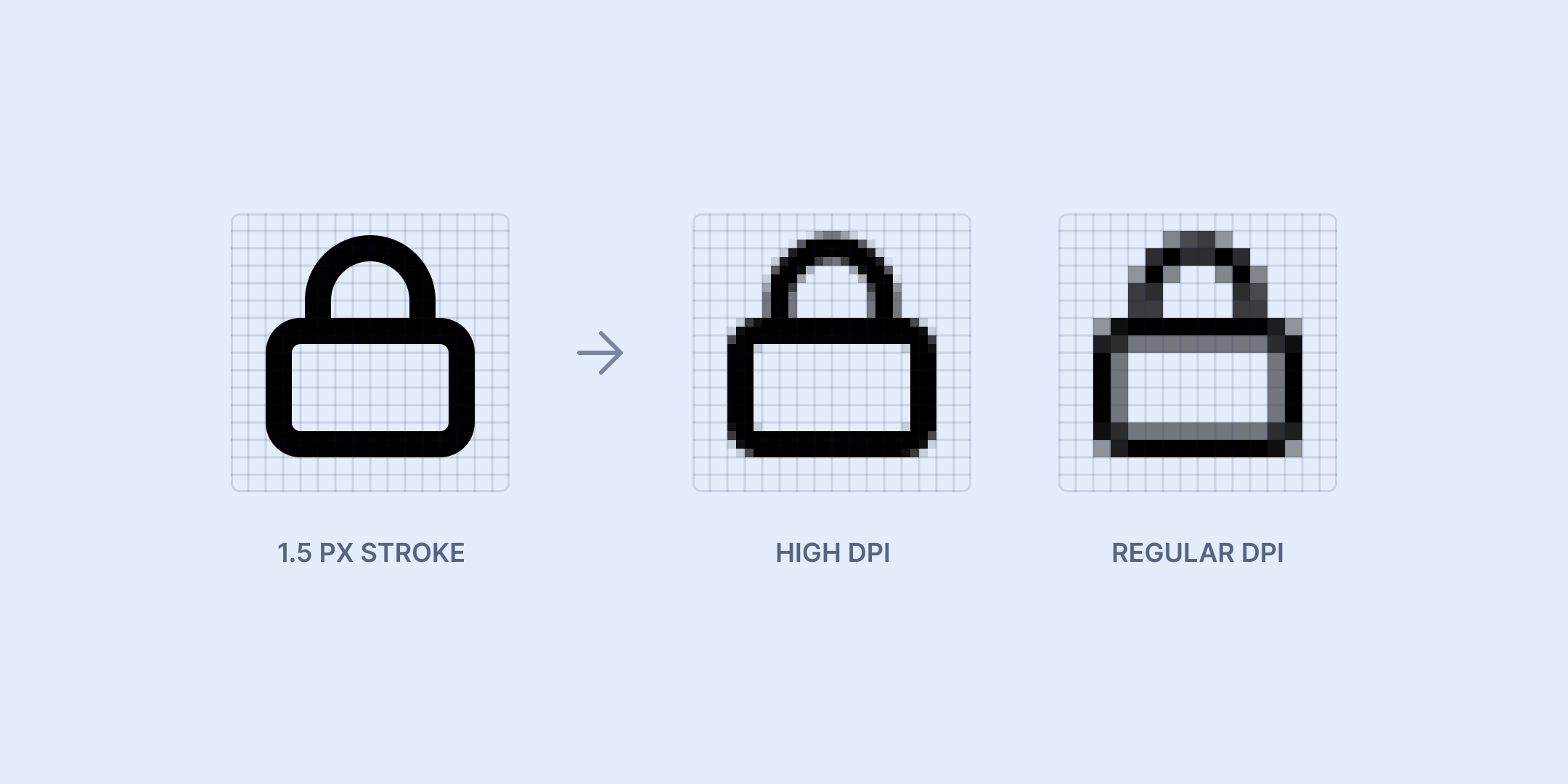
In a relatively recent release, we included an updated set of icons. At the point of the release, we hadn’t yet started to open the gates for pre-launch users, meaning the change wouldn’t be visible for many. But even if it had been, I suspect most wouldn’t even notice. Why? The primary change was adjusting the stroke thickness from 1.5 px to 1 px.
The first set
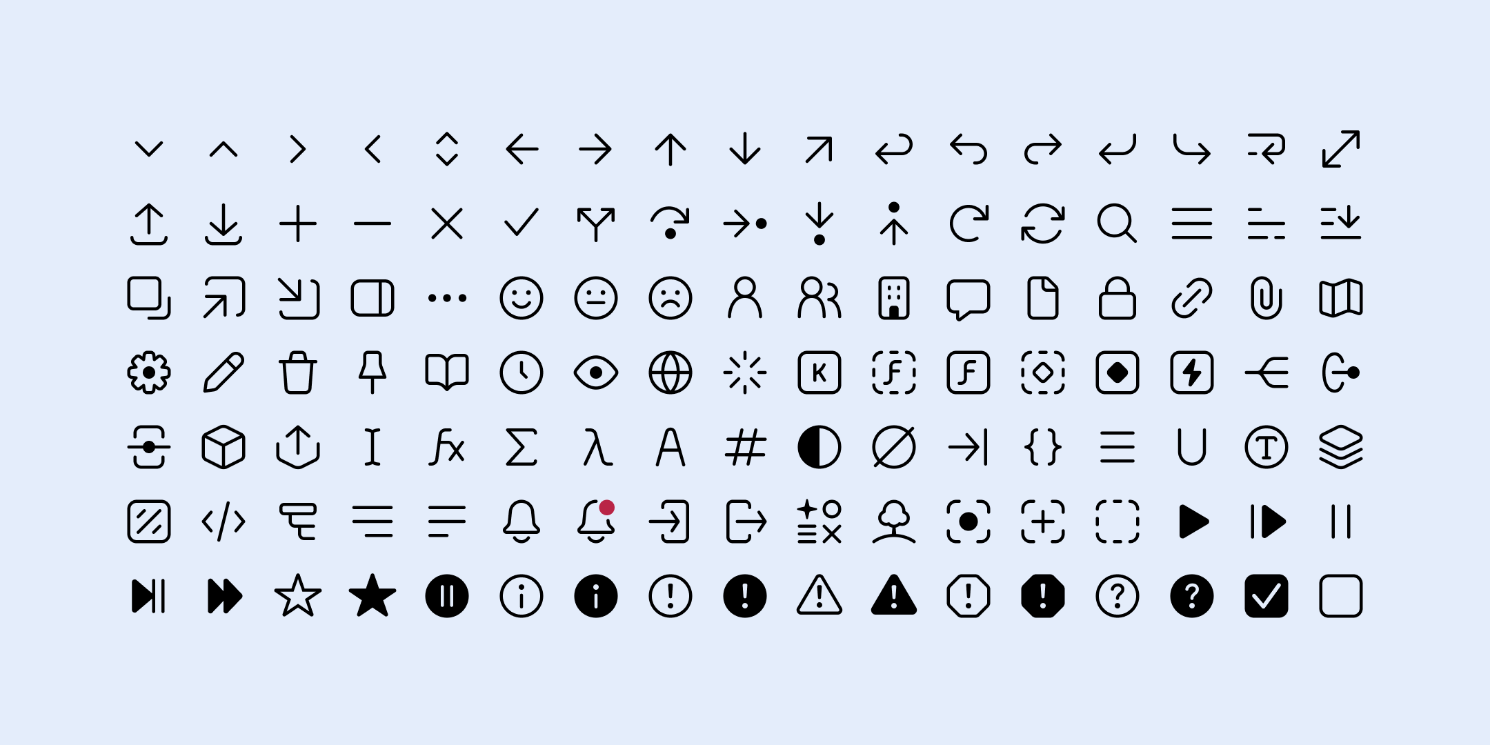
Our set of icons is custom-drawn. It gives us the flexibility to accommodate very specific use-cases, which are quite common in a dev-centric SAAS product. Good luck finding an icon pack that pairs “Get variable”, “Anonymous function” and “Any type” in an elegant way, if at all. Another plus is that you can mix in some unique flavor. It may be subtle, but it will influence the vibe of using a product and potentially tie it to the brand in a way that a pre-made icon set can’t. Again, it’s subtle, but I believe it’s impactful.
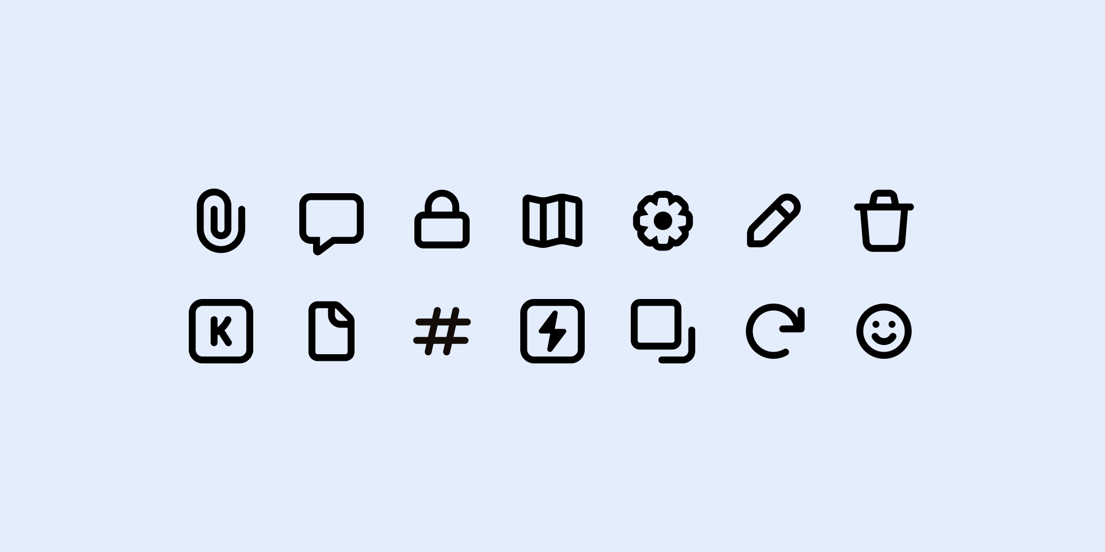
As we started defining our current product look a few months back, I hammered out icons one at a time whenever we needed them. First came arrows, a magnifying glass, a trash can, then a cogwheel. The usual suspects. In not wanting to spend days perfecting the look of the icons when the entire UI was being revamped in a week, I went with a common 1.5 px stroke width (not too thick and not too thin) with subtly rounded corners in a 16 px frame. They had some personality to set them apart from an off-the-shelf set.
The change
They served us well for many months and looked the part, at least on the high-DPI Retina screens I use. There is a definitive push towards icon packs from Google and Apple and the like that emphasize versatility over screen optimization (where line thickness is tied to font weight and size rather than set pixel values), which has led me to use 1.5 px strokes in many prior icon sets. But there was no way around the fact that many people using our product would be looking at icons that appear blurry. A 1.5 px stroke on a regular old @1x desktop screen would not look as sharp as a 2 px or 1 px stroke. Prioritizing the actual experience for many of our current users rather than only the ideal “future” user felt important.
Of course, it must be mentioned that my inner being ached for an update on purely aesthetic grounds as well. The previous icons just felt too thick. I wanted the impression you get from using Midio to be lighter, especially since there can be so much happening on the screen at once. So the two considerations coincided. And it was also a good opportunity to tune them all up so that they appeared more cohesive size-wise.
One might be inclined to call it wasteful to spend time changing and fine-tuning the look of icons when you haven’t even launched your product properly yet. And one might be right, if user count or monetary success is the only metric. But in giving the (correct) impression to users that you’re heavily devoted to the quality of what you deliver, it can be important. Not to mention the positive impact a culture of sweating the details has on a workplace.
Future considerations
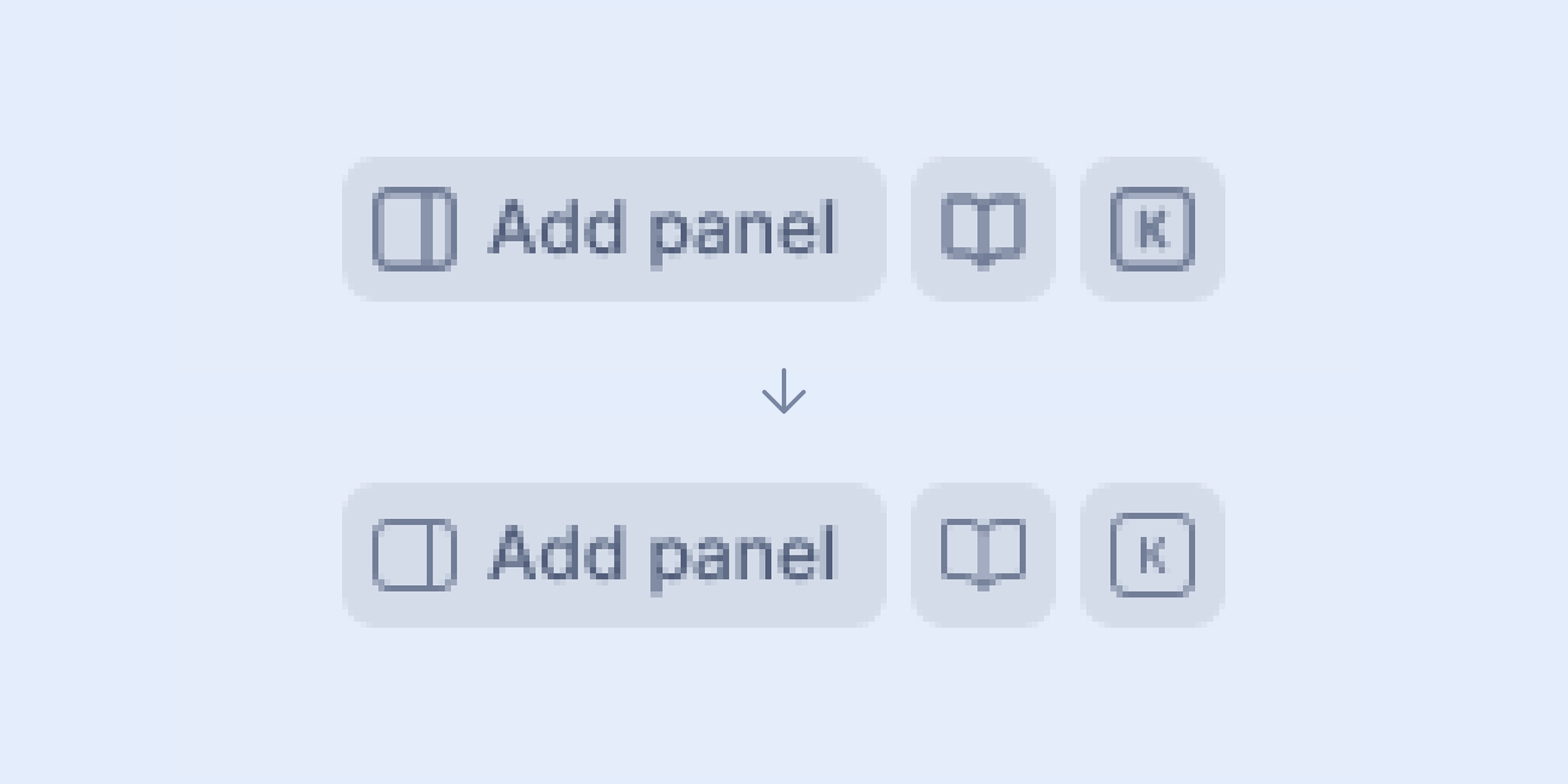
With 1 px icons there are still lines that need to be centered within a 16 px frame, resulting in a wider/blurrier line for the non-high-DPI screen users (see the documentation/book icon in the example earlier). At this point I consider this an okay compromise, but we’ll see what the future holds.
Another is the fact that the icons might be a bit too friendly-looking for what we want Midio to feel like. The future might bring slightly sharper corners, and possibly upping the personality a bit, too. I have ideas.